


A Brief History of Typography
A little insight into the history of not only Typography, but also of written language. This article will be far from covering it all, but focuses on highlighting some of the major events and periods in the history of Typography.
Typography
From the Greek roots τύπος typos = "impression" and -γραφία -graphia = "writing".
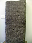
Cuneiform
~ 30th Century BC – 200 ADOr "Script of Nails / Cuneiform Script" is probably the oldest form of written text. This calligraphic form of writing was carved into clay tablets.

The Latin Alphabet
~ 800 BC – presentThis is the basic alphabet used in all Western languages. The Romans based it among others on the Greek alphabet and it has since delevoped into the form we know today.
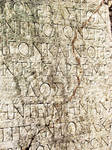

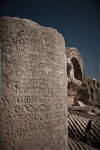
In its original form the Latin Alphabet only contains Uppercase letters. Lowercase letters began as the quicker hand written form of those, which changed their shape to rounder and simpler forms due to the speed of writing. Up until 1300 there was no real distinction between Uppercase and Lowercase. The earliest rules for capitalization of letters were not made until the 18th century.
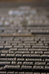
Movable Type
1040 ADMovable Type was used for the first time in China and Korea using ceramics or wood. For this technique single characters are placed into a frame and can be re-used for more pages later.
Before this invention, one page or test was carved into wood or cast into metal and used for re-printing. Every page or text had to be created from scratch and could only be used for one purpose.
Printing Press
1450 ADIn the Renaissance Johannes Gutenberg invented the Printing Press using Movable Type cast from metal. This opened the doors to industrial mass-bookprinting, as before books were copied by hand.
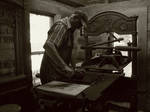
The first book to be ever printed in Europe was the bible (one of the most printed books ever, but the IKEA catalogue is catching up). Being able to produce many books so much quicker, the invention of the Printing Press also gave more people access to education and knowledge, ultimately leading to the world as we know it today.
Typefaces
15th centuryWith the invention of the Printing Press also started the evolution of Typefaces. Inspired, like the whole Renaissance, by the antique Roman art and lifestyle, Typefaces were being created to be cast into metal and used in printshops. These new Typefaces deviated from the hand-written appearance into something that was closer to the engraved Roman lettering.
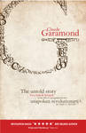
Nicolas Jenson and Claude Garamond were some of the first creators of typefaces. The typeface Garamond itself or derivates of it (ITC Garamond and Apple Garamond) are still being used nowadays, despite the original Typeface being more than 500 years old.

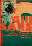
Early Typefaces all display Serifs on the characters. The first Sans Serif Typeface was created in 1816 by William Caslon IV, great-grandson of Typeface Designer William Caslon. One of the oldest Sans Serif Typefaces is Akzidenz Grotesk from 1896, more famous typefaces from the 1920s are Gill Sans and Futura.

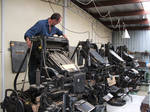
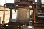
Linotype Machine
1884 AD – ~1970sThis machine invented by Ottmar Mergenthaler changed the industry of printing and Typography once more. As its name suggests, it sets type in one line. Contrary to placing ever character by hand, it makes it possible to actually type (like a typewriter) lines of text and speed up the process of setting type immensely. The first newspapare to use a Linotype Machine was the New York Tribune in the 19th century.

To understand this machine better, please read the Linotype machine Wikipedia article, as I fail to actually explain this so complicated yet amazing machine!
I also highly recommend watching "Linotype: The Film" a documentary on these amazing machines.
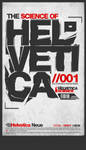
Helvetica
1957 ADAlso known as Neue Haas Grotesk, is probably one of the most famous typefaces of our time. It was developed by Max Miedinger and Eduard Hoffman in 1957 and has since become one of the most recognized Sans-Serif typefaces.
 :thumb49295189:
It is also a controversial typeface, both loved and hated for it's heavy usage. The biggest benefit of this typeface is exactly what some people dislike about it: neutrality. Helvetica's most striking characteristic is, that it is so neutral it can be used for any purpose. Of course this leads to the typeface sometimes being used out of principle, rather than for aesthetic purposes. It widely spread usage, from trademarks to signage, is what really disgusts some people about it, same way Comic Sans does.
"Helvetica" is the name of a documentary feature film about the typeface, released in 2007 by Director Gary Hustwit for the 50th anniversary of the typeface.
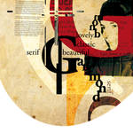
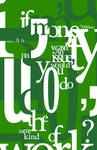
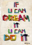
Experimental Typography
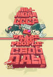
20th CenturyThis form of Typography is more of an artform, than a design technique. Readability stops being the main concern of Typography and it starts speaking for itself, instead of being a means of transporting a message.
This started as early as the Dada Period between 1916 – 1922, but the most famous artist of this form is probably David Carson. His style ignores most rules of layout and design and creates something new, essentially an artform.
 :thumb76040016:
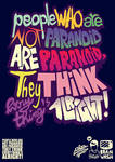
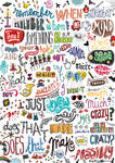
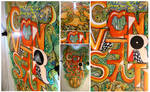
Today
Typography is open to everyone. If you have an idea and you can visualize it, you can create Typography. Modern digital media opened the doors to a whole new world of Typography.
Typography can and is created by all possible media, tradtitional and digital and even sculptural! There is no limit as to what you can use to create Typography!


The Future
2012 – …Who knows? This is the exciting part! You never know what will come and making predictions is hard.
But we can work on this together! By developing our own work and finding new inspiration we will work to evolve Typography.
Thank you for reading!


Project Educate: Typography – Overview