


Project Educate Typography –
Interview with shoelesspeacock
During this week of projecteducate there will be some interviews with artists, designers and typographers from dA. This is the first interview of the week. Please enjoy!
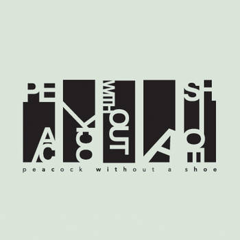
Today I present an interview with London based Artist and Designer shoelesspeacock, you may also know him as Peacock Without A Shoe.
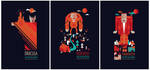
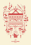
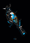
His modern and detailed works are inspiring and true sources for finding the awesome details when you take a closer look. Strong geometric shapes and bold colors are one of his trademarks and make his work stand out.
You can find him on twitter, facebook, behance and redbubble.
Please introduce yourself!
Petros is my birth name, although Microsoft word likes to thinks I am incorrect. I do not eat healthily. I have more USB sticks then I do t-shirts. I never go shopping. I always find new stuff in my wardrobe. My desktop does not have one icon on it. I don’t answer private numbers. My worst nightmare was based around the Helvetica font. Life is good, Death is inevitable. Money is the root of all evil. Money is the root of all good. I like finding money in my jeans. I consume pantones for dessert.
How did you get into art and design?
At the tender age of 17, I decided for a course change as I was sick to death of working on databases and spreadsheets throughout my computer course years. I therefore took the plunge and enrolled myself in a multimedia course and slowly climbed my way into doing a degree in graphic design. I'd say what inspired me to take a sudden turn in my career path was the ideology of being able to create, manipulate and form something out of nothing, to create meaning and concept through a piece of work that you've built from your very own imagination.
Where do you find inspirations for new works?
My main source of inspiration is music (from classical to electro jazz) and anything I see during the course of my day to day activities. Some of the best ideas are surprisingly driven by non-graphic mediums, such as the environment I’m zoned in, like a sweet summer morning at a local park, or that really tasty New York cheesecake I devoured for lunch, or even the delightful flower bed the next door neighbour set up on his front porch.
How important is the sketching process to you?
For me, sketching is preliminary rule of thumb before the beginning of any project. It acts as a starting point for an idea that eventually develops into a final outcome. In my case, sketching starts out with the use of my tablet to sketch ideas digitally and progress any further developments on my art board.
What advise would you give someone who wants to get into design, typography or art?
Find your niche by trying out a variety of graphic mediums and embrace that spectrum in which forms your creative outlook. Take negative criticisms as feedback and improve on your flaws. Better yourself by trying out more than one technique. Don't always stick to one font, there are thousands out there. Experiment with font families, work with light/bold typefaces, use kerning and leading when appropriate. And finally, don't hesitate to look for other sources for inspiration, be it magazines, art communities or design blogs.
How important is Typography for you / your work?
Typography in my opinion is massively overlooked in digital and print media. It is the quintessential element for compositions that require it and can often add icing to the cake. For me, typography forms an integral part of graphic design when being used on anything from a billboard advertisement, to an intricate business card.

Do you think it helps young artists to join online communities?
It certainly does! To anyone who thinks otherwise is barking mental. Online communities act as a great way of marketing yourself and establishing your existence as an up and coming artist. It also helps build relationships with like minded individuals and opens up a whole new border for collaborations, as well as exposing your artistic finesse.
Most of your work contains a majority of vector elements… Why do you think vector plays such a big role?
It depends on one’s style. Personally, I just like the clean and boldness of a vector composition. And the fact that you can blow it up any size, tickles my fancy. That’s not to say I like to sometimes take my pieces into Photoshop and add further elements to it, but that’s a whole different process known as a Vexel.
I see a lot of symbols and geometric shapes in your works… Where does that influence come from?
I’ve always been fond of the idea of shapes, lines, small elements that combine and develop into something bigger. It’s always been an imprint of how my medulla oblongata functions. When it comes to design, I like the elaborate little delicacies of how it was shaped and formed, rather than viewing it as an overall piece.

How do you go by finding colors for your work; Trial & Error or do you pick them before you start?
Colour comes at the end. I’m a firm believer that if a design doesn’t work in black and white, then adding colour to it is only sugar coating the rubbish bin.
Is there any medium or style you haven't tried so far, but would love to play with at some point?
Working with found objects and photography is something I’ve always been keen on, but never actually had the chance to delve into it. I intend on releasing a series of works soon that’s definitely different to anything I’ve ever worked on before, so stay tuned for that juicy goodness!
What's your 3 favourite pieces from your own work?
I really enjoyed working on the McJunky project as it’s a testament to my undying love for junk food. The animal species campaign is another ongoing brief I adore, as I’m a huge fan of wildlife, as well as charities and communities that raise awareness on endangered animals. Other works include my Microsoft IE9 branding communications project which won a D&AD award, as I had fun trying to make one of the world’s worst ever browsers into a repackaged, functional, speedy entity that would dominate any other browser in the market. (if only half of that was true)

You can also find him here:
twitter
facebook
behance
redbubble
Thank you for reading!


Project Educate: Typography – Overview

