


Typography Terminology
This article is here to highlight some of the most important terms when it comes to working with Typography. The terminology in this article is very basic, but it's not only for beginners! Knowing the proper terms for whatever you do avoids confusion and makes it easier for people to be on the same line of thought.
Please note: these terms all refer to the technical work with Typography. They do not cover the Anatomy of Typefaces (f.e. baseline, x-height or serif) or stylistic elements used in Typography (f.e. page layout or white space).
Typeface
A Typeface is the compilation of a set of characters, which share a certain appearance. There are stylistic elements to each Typeface that also find relation to their classification.
While a Font traditionally only describes a set of characters in a certain set size, a Typeface contains all fontsizes in one. Nowadays font files like .OTF and .TTF are Typefaces that can be scaled infinetely due to their vector properties.
Point Size
This describes the size of your text. Up until the 1980s there was no standarized measuring for Point Size, but with the beginning of Desktop Publishing a common size was introduced: Point. It uses 72 dpi as base, 1 point being 1/72 inches.
Line Length
Describes how many characters of a text appear in one line, before a line break is entered. This is depending on page size, layout, typeface and Point Size. For printing, a comfortable Line Length is 66 characters.
Leading
Or Line Spacing, describes the space between two lines of text. Leading measures the distance between the baseline of succesive lines of text.
To optimize Readability this number varies between 120% and 150% of the Point Size.
Tracking
Or Letter-spacing, refers to the amount of space between a group of letters to affect density in a line or block of text.*
Tracking always adds more space between letters and words, it can also be referred to as "positive spacing". It is always applied to a whole paragraph of text.
Kerning
Adjusts the distance between 2 letters. It usually decreases space between 2 letters, as opposed to Tracking.
In a well crafted Typeface, each pair of letters is kerned by the Type Designer before the typeface is even used.
Style
Most Typefaces come with a variety of Styles, the most common ones being: Bold and Italic. These styles stay faithful to the look of the overall Typeface, but show variety in stroke width and/or slant.
Styles can be combined as to become Bold and Italic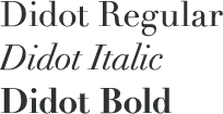
Other possible style variants:
Condensed (A slimmer / thinner version of a typeface)
Expanded (The opposite of Condensed, a wide variant of a typeface)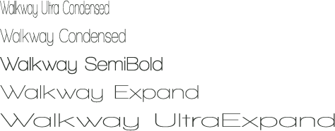
Light or Thin (The opposite of a bold style, decreased stroke width.)
Black (Increased stroke width beyond a Bold style)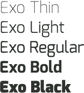
Sometimes "Extra" or "Ultra" is added to a style, which indicates a more extreme version of the variant.
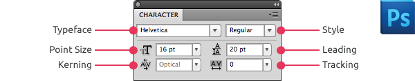
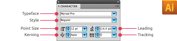
To illustrate where you can find those settings, when working in Adobe Photoshop or Illustrator, you can find some screenshots from those programs. The same elements are used in most graphic programs and follow a similar structure.
The Character Panel in Photoshop CS5
The Character Panel in Illustrator CS5
Check out a bigger list of typographic terms in the ABCs of Text Art & Typography
A - H | I - R | S - Z
Thank you for reading!


Project Educate: Typography – Overview