
As new partner in crime for your Text Art Gallery Moderator Sander-Seto i thought it was time to write a News Article about Text Art.
Maybe the Text Art Tips will turn into a series of articles.
What can you expect? My aim is to give you some tips on how to improve your Text Art.
Really, dont rush any artwork you are doing. Especially in Text Art it is easy to just add a line of text to a canvas and you think you're done. This is not the case. Try different things, experiment with colors, with font sizes, textures, canvas sizes, kerning and and and. Just don't be done in 5 min.
While Grunge Fonts like Bleeding Cowboy or Typewriter From Hell look interesting and exciting, you really shouldn't use them for your artworks. They are mainly just easy and lazy to use. You can achieve way better results by making a font like Helvetica or Garamond grungy with layer masks or adding elements. They also make the whole piece more controllable for you.
(Everybody goes through a Grunge Font phase, i did that myself )
)
You are welcome to try out Text Art Tutorials, you will always learn something new with every tutorial you follow. And you are of course free to make it look exactly as in the tut. But once you've done that... think about how you could use what you just learned again. In a new piece. In your own piece!
When working with Photoshop or Illustrator you get that little window in which you can choose your font, fontsize etc. Some of the options you really should not use for creating artworks.")
Don't scale the fonts width or height.
This destroys the font you are using. All the balance that went into creating this font will get lost.
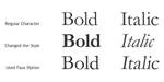
Don't use the faux bold or italic button!
This will make your computer twist the font. Instead use the dropdown field beside the font name and choose the bold or italic style from there. Why? Because a Font Designer creates the other styles of the font manually. Also, italic fonts are meant to appear with a hand written look, especailly with Serif Fonts you can see that the serifs will become curvier.The faux buttons will either fatten or bend the type electronically, it's a fake font style.
(Actually "faux" is what happens when you use an italic or bold style in a browser. Just btw (Wink)") )
)
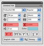
The Photoshop CS4 Character Window and examples of how the faux options work.
If you are working with typography you probably heard that word before But what exactly is it and what does it do for you?
Just like in the Character Window the best example for this are the A and V letters. If no kerning is applied a huge space appears between those 2, with kerning applied (auto or manually) both letters overlap each other but look more appealing to the eye.
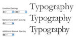

Some examples to show you what Kerning will do for you.
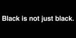
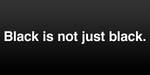
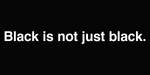
Black is not always black. Using 100% black as color for your type or background may not always be the best decision. Using a 80% black gives you a smoother look and leaves you more options for light textures or effects. You can also add transparent gradients or solid color layers to a black background to give it more depth. Try it and it might get a more appealing look than 100% black.


While the first one is just plain white on black, the others ones show how a little optimizing improves the look.
Especially those with shadow, glow or bevel/emboss. They are not pure evil, but at last don't take the standard settings and leave it with that. A well used shadow/glow can improve readabilty of your text on some backgrounds. If your imitating some sort of cut out or pressed paper those effects are of very good use, too. Just be careful with what you do. Overused effects easily look cheap or cheesy.


Just be careful
You made a typographic illustration. Wether it is just placing a line of text or creating a typographic logo design. Please refrain from presenting it just black on white (or white on black ). It will look boring, flat and uninspired. Your design has a meaning. Show it with presenting it good.
How to present your design? Use colors for the letters or the background. Play with an image. Maybe use some textures or patterns. Try to create an atmosphere that supports your design.


How a typo design can be improved from a simple and flat black on white, to more depth with colors, texture and different blend modes. Crappy example, i know.
I'm serious Do it. Ask an online dictionary or ask a friend, but do check the spelling. Or grammar if it's more complicated. But you don't want a good looking artwork with wrong spelling.
Like Paul McCartney said once: "If the song is too short and you have no more lyrics... repeat the first verse." (at least i think it was him) so, here we go 
Really, dont rush any artwork you are doing. Especially in Text Art it is easy to just add a line of text to a canvas and you think you're done. This is not the case. Try different things, experiment with colors, with font sizes, textures, canvas sizes, kerning and and and. Just don't be done in 5 min.
Some of the Typography Tutorials from deviantART:
:thumb73108686:

29 Excellent Typography Tutorials for Designers
22 Stunning Typography Tutorials on Photoshop
11 Amazing Tutorials combining Great Typography and Skillful Vector art.
101 Top Photoshop Typography Tuts
40+ Killer Typographic Posters, Photoshop Effects and Tutorials
33 Best Typography Effect Photoshop Tutorials
I hope this News Article was helpful
Feedback is highly appreciated (Smile)")
cheers,
pica-ae
Maybe the Text Art Tips will turn into a series of articles.
What can you expect? My aim is to give you some tips on how to improve your Text Art.
So, Here Are Some Tips To Help You Improve Your Text Art
Take your time!
Really, dont rush any artwork you are doing. Especially in Text Art it is easy to just add a line of text to a canvas and you think you're done. This is not the case. Try different things, experiment with colors, with font sizes, textures, canvas sizes, kerning and and and. Just don't be done in 5 min.
Don't let the Font do the Artwork for you!
While Grunge Fonts like Bleeding Cowboy or Typewriter From Hell look interesting and exciting, you really shouldn't use them for your artworks. They are mainly just easy and lazy to use. You can achieve way better results by making a font like Helvetica or Garamond grungy with layer masks or adding elements. They also make the whole piece more controllable for you.
(Everybody goes through a Grunge Font phase, i did that myself
Follow Tutorials, but don't copy them!
You are welcome to try out Text Art Tutorials, you will always learn something new with every tutorial you follow. And you are of course free to make it look exactly as in the tut. But once you've done that... think about how you could use what you just learned again. In a new piece. In your own piece!
Don't use all the options in your characters window!
When working with Photoshop or Illustrator you get that little window in which you can choose your font, fontsize etc. Some of the options you really should not use for creating artworks.
Don't scale the fonts width or height.
This destroys the font you are using. All the balance that went into creating this font will get lost.
Don't use the faux bold or italic button!
This will make your computer twist the font. Instead use the dropdown field beside the font name and choose the bold or italic style from there. Why? Because a Font Designer creates the other styles of the font manually. Also, italic fonts are meant to appear with a hand written look, especailly with Serif Fonts you can see that the serifs will become curvier.The faux buttons will either fatten or bend the type electronically, it's a fake font style.
(Actually "faux" is what happens when you use an italic or bold style in a browser. Just btw
The Photoshop CS4 Character Window and examples of how the faux options work.
The Mystery of Kerning!
If you are working with typography you probably heard that word before
From Wikipedia:
"Kerning is the process of adjusting white spacing in a proportional font. In a well-kerned font, the two-dimensional blank spaces between each pair of letters all have similar area."
Just like in the Character Window the best example for this are the A and V letters. If no kerning is applied a huge space appears between those 2, with kerning applied (auto or manually) both letters overlap each other but look more appealing to the eye.
Some examples to show you what Kerning will do for you.
Using Black?
Black is not always black.
While the first one is just plain white on black, the others ones show how a little optimizing improves the look.
Be Careful With Effects!
Especially those with shadow, glow or bevel/emboss. They are not pure evil, but at last don't take the standard settings and leave it with that. A well used shadow/glow can improve readabilty of your text on some backgrounds. If your imitating some sort of cut out or pressed paper those effects are of very good use, too. Just be careful with what you do. Overused effects easily look cheap or cheesy.
Just be careful
Don't forget to present your artwork!
You made a typographic illustration. Wether it is just placing a line of text or creating a typographic logo design. Please refrain from presenting it just black on white (or white on black
How to present your design? Use colors for the letters or the background. Play with an image. Maybe use some textures or patterns. Try to create an atmosphere that supports your design.
How a typo design can be improved from a simple and flat black on white, to more depth with colors, texture and different blend modes. Crappy example, i know.
Check the Spelling!
I'm serious
Take your time!
Like Paul McCartney said once: "If the song is too short and you have no more lyrics... repeat the first verse." (at least i think it was him
Really, dont rush any artwork you are doing. Especially in Text Art it is easy to just add a line of text to a canvas and you think you're done. This is not the case. Try different things, experiment with colors, with font sizes, textures, canvas sizes, kerning and and and. Just don't be done in 5 min.
For Further Reading...
Some of the Typography Tutorials from deviantART:
:thumb73108686:
Some tutorial collections from around the web:
29 Excellent Typography Tutorials for Designers
22 Stunning Typography Tutorials on Photoshop
11 Amazing Tutorials combining Great Typography and Skillful Vector art.
101 Top Photoshop Typography Tuts
40+ Killer Typographic Posters, Photoshop Effects and Tutorials
33 Best Typography Effect Photoshop Tutorials
Thanks For Reading!
I hope this News Article was helpful
Feedback is highly appreciated
cheers,
pica-ae