


For more info on this week, please refer to The Artists Toolbox - Schedule at projecteducate
In this toolbox you will find helpful tips for digital typography. For those of you new to the topic, let's start with a short explanation
Typography is the art and technique of arranging type in order to make language visible.
Pretty simple, eh? Basically as you are reading this you are "reading typography". What I will refer to in this article is digital artistic typography, though. This is not the everday typography you see on street signs, books or on websites.
 :thumb327494309:
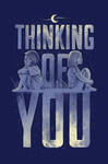


It can be anything! Which is amazing and scary at the same time
Here's a little overview of this article:
- Read tutorials
- Get your hands on fonts!
- Manage your fonts!
- Work your art! Aka software tips.
- Prepare your art: Concept!
- Share your work in groups!
So, let's dive right in!
 Read Tutorials!
I wish there was a site that was only about Typography tutorials! Unfortunately they are scattered all over the place.
There are two kinds of tutorials for typography:
- Design Tutorials: they teach you everything you need to know about typography, fonts, ligatures, classes, combinations etc. These are aimed at designing with type, for the web, print or film in order to transport information to the viewer.
- Art/Illustration Tutorials: they teach you how to create a certain effect, style or look for type. They often dive into other fields like vector, photo-manipulation or 3D and their purpose is to create a work that can stand on its own.
Here is a small collection of basic tutorials
Typeface Anatomy and Glossary | FontShop
A 20 Minute Intro to Typography Basics | Psdtuts+
Search Computer Arts for typography
Search Tuts+ for typography
It is hard to find one site that has all great tutorials on typography. They are very scattered and most google results are articles that collect tutorials. So the best tip is to find what you like yourself and just do it. Practice makes perfect and is fun!
Tip: Try not to follow a tutorial 100%. Change the font, the colors, the images. Bring yourself into the work!
It's totally fine to repdrouce a tutorial result that looks exactly like the tutorial, but there is nothing of you in there. We want to see what YOU make out of a tutorial, what it inspired YOU to do!
There are certain tutorials of which I have seen hundreds of deviations from. It gets boring after a while. Especially when the tutorial is several years old and design and art trends have actually moved further and developed. Don't get stuck in that!
 Get your hands on fonts!
Fonts bring language to life! The right or wrong font choice and make a design fantastic or ruin it. That's why you need to think carefully about what fonts to use! And be prepared to test, test and test again. But for that, you need to have a good selection of fonts
You can browse the dA Stock & Resources > Fonts gallery to find some amazing free fonts.
There are also the usual suspects for "free fonts":
And some more specific sites:
Always read the licence that comes with a download! The fonts may appear free at first, but there might be some commercial restrictions applied. Credit on your work also doesn't hurt
So, with a day or more spent download awesome fonts, you're now in front of a true font mess. 3.000 fonts and all active?! It will probably take minutes to load that list in any graphic program you are using. To avoid long loading times, you have to …
 Manage your fonts!
Personally I am still using an old and free version of Font Explorer, the new Font Explorer X is available for 100$/79€ after a 30-day trial period. I find this management system to be very convenient and easy to use. You can create groups for fonts, f.e. following one of the many classification systems or your own taste.
Managing your fonts will not only save you time in graphic programs, but also help finding the right font much faster in your font library. You can preview texts and only activate the fonts you really need for an artwork.
While Mac OSs come with their own "manager" Font Book, I am not aware of Windows coming with any software to help manage your fonts.
I came across two good looking management softwares, both of which I unfortunately cannot test for you: Nexus Font and CFont Pro. Most articles on the subject are rather old, so my best idea is to link you to the wikipedia article about it
Generally, Font Explorer X is the top range when it comes to prices, most programs I found are below 100$, so they are not much of a big investment.
 Work your art! Aka software tips.
There are many many graphic programs out there and some are better for typography than others. I usually work with programs from the Adobe family:
Photoshop is a pixel-based programme. So when you start your artwork make sure you know how big you want the result to be. If you want to print it at some point, make sure the canvas is big enough cos you won't be able to make it bigger later. Despite being pixel-based, Photoshop does support vector shapes, so when working with type, I would always suggest you turn the letters into paths and not raster layers to maintain editability.
Illustrator is probably the best programme for Typography. Text and Fonts are vector-based and therefore a vector-based programme is the best one to work with. You will always be able to fit the canvas into a new size without a loss of quality. Multiple canvases since CS3 make working on versions of the same work easy, as well as working in more than one format on a topic.
InDesign is the standard program for print publications, ranging from flyers to magazines and books. It offers the most options for working with type, especially long texts are best edited in InDesign. It offers single and double page spreads as well as automated pagination, to name only a few features. Image are treated as links, thus keeping the program fast, as all other elements are vector based.
Of course you can combine as many programs in your digital process as you like
 Prepare your art: Concept!
It might be personal, but I have a dislike for typography that has no real message. It is words that you work with, let them tell a story! Here is where concept comes into the game! This is not about "conceptional art" as much as it is about an idea. Why are your creating what you are creating? What made you do it?
For example you read this great tut about a cool effect and you want to duplicate it. So you type out the word "typorgraphy" and you apply the effect to that. It is porbably a good training for that effect, but does it have a message? To me, the message it sends is: "I did not know what to say." And do you want that?
A solution? Find themes that move you, something that inspired you. Don't be generic! Be creative! Think! The world is big and wonderous, I am sure there is something you want to share your feelings about with your art.
As soon as you have an idea, write it down! Start research, collect inspiration, revisit the idea, sleep over it, take a walk with it, sketch it, sketch it again! You will see, the more time you invest into your idea, the better then end result will be. And if you invest part of yourself, your work will be unique. You are unique, so let that flow into your work! Don't be afraid of inspiration though. Uniqueness is not the same as originality. (and originality... different field
Don't just dive into art headlessly and without a concept. If your concept is "I will doodle and see what happens." that is a concept too
 Share your work in groups!
There are many groups on dA dedicated to Typography and Fonts! You will find more artworks and artists, you can submit your own works (the each group's rules of course) and enjoy being among people who love that same things you do